It’s a little bit old news now, but I’m very pleased to announce that I
recently teamed-up with Andrew
Gunstone to
form Thirst Studios.
Andrew and I decided to join forces in order to offer a more complete
end-to-end service to our clients, with me heading-up the strategy, IA,
design and user-experience side and Andrew taking care of the back-end
code and CMS development (but we both do a bit of everything in
reality).
Check out the new Thirst
Studios site and let me
know what you think.
As usual it’s been a busy few months here at BTD, having spent most of
my time of late working with a fantastic team over at Cummins
Nitro on a really
interesting project - The Best Job In The
World.
The site launched this week and has already had a phenomenal response,
with a rush of dream job hopefuls causing the site to crash in just two days of it’s
release.
Besides looking great with a nice design, great imagery and smooth flash
work there’s a lot going on ‘under the hood’. This is easily the biggest
site I have worked on in terms of ‘whistles and bells’. It makes use of
over 30 scripts, libraries, frameworks, plugins and API’s, and just how
the team enabled all of these to work in harmony across the site whilst
still adhering to web standards is really quite an achievement!
Hats off to Matt, Horia, Glen, Anton and Mark. Great work, guys.
I was recently approached by Luc Arnold, founder of Spicy web
designers
to be interviewed for his new site.
In their own words:
SpicyWebDesigners.com features some of the hottest web design talent around the world and strives to showcase them and inspire others with what is possible in the world of web design.
It’s really nice to have been considered worthy of a listing amongst
other great designers such as Chris
Dawson and
Elliot Jay Stocks!
I was conducting a review of some XHTML and CSS templates for a client
recently when I came across an interesting SEO concept that I hadn’t
heard of before. At first I was skeptical (and I still am a little), but
upon closer inspection I started thinking that there could be something
it it. Not only in terms of SEO, but accessibility too. The articles I
found describing this technique date back to 2004-5 and the fact that
I’ve not found anything more recent on the subject just further fuels my
skepticism. Anyway - I thought I’d post my discovery here and see what
the wider web design world had to comment…
So what is it? Well, the idea is this: Rather than structuring your HTML
in the usual order of header/navigation, content and footer, you build
the pages such that the main content appears first, with the navigation
and footer underneath. Then, using CSS to style the page you pull the
navigation/header back up to appear above the content when viewed in a
browser.
The articles I found describing the technique promote the idea that
doing this will raise the relevance of your page within search engine
rankings since it’s believed that some spiders only read the first few
characters, or give more weight to content appearing towards the top of
a page. You can see the articles here:
Tech republic’s ‘Rearrange page code to raise text relevance’article.
Brook group’s ‘Putting Content First: SEO and Advanced CSS’ article.
It does seems to make sense, but does anyone know of any evidence to
support this?
While this is all very interesting from a SEO point of view, what
interested me more was the idea that this method of marking-up a page
could actually aid usability and accessibility for those using assistive
technologies like screen readers, or people with old mobiles or PDA’s
that can’t handle CSS very well. Traditionally we responsible web
designers have added things like ‘skip to content’ links within our HTML
markup to help such users, but this negates that need since upon
arriving at a page coded like this, the user is presented with the
article title and the article immediately without the need to skip past
the logo, navigation etc. The flip-side of course is that they would
require a ‘skip to navigation’ should they want to navigate away from
the page quickly.
There is another argument I can think of against this method and that’s
down to good usability through consistency. By this I mean most, if not
all pages are currently marked-up in the traditional way that I
mentioned before: header/navigation at the top, then content and then
the footer. As a result, most people visiting websites using assistive
technologies will be familiar with the current structure, expecting to
find the header information and main navigation at the top of the page
and used to the idea that they need to skip past this to reach the
content. As such, re-arranging the HTML as these articles suggest could
actually do more harm than good as it’s an unconventional approach and
inconsistent with most other sites.
Have any of you ever actually implemented this technique anywhere? Does
it work? What are your thoughts?
Having experienced many online offerings from local governments and
local councils in the past, as well as having worked for a few, I had
pretty much resigned myself to accepting that most are going to be
rubbish in terms of antiquated code using tables for layout and inline
styles, bad interface design, little or no regard for usability or
accessibility and, more often than not containing outdated content.
Whatever the reasons for this, be it that the website is perhaps
considered a low priority, that there’s no dedicated resource allocated
to the website or that it’s simply too hard to get people to agree to a
redesign, the sites’ users seem destined to lose-out.
This has always amazed and concerned me considering the broad, diverse
user base that these organisations must have, and the importance of the
content to a lot of people.
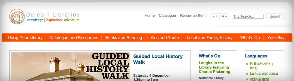
I was pleasantly surprised therefore, by the Darebin
libraries
website that I discovered this week. Not only is the site nicely
designed with a simple, clean interface, but it’s nicely coded too, with
semantic (x)HTML, clean CSS and carefully implemented javaScript that
helps maintain good accessibility through the use of graceful
degradation techniques, otherwise known as progressive enhancement.
I’m really pleased to announce the launch of my latest website - I vote
for
art.
It’s a new online gallery, where you can buy and sell art, as well as
vote for your favourites.
I Vote For Art homepage
Based in Melbourne, Australia the site showcases some fantastic
contemporary work by local and international artists.
An example detail page
Thanks again to the wonderful Andrew
Gunstone
for assistance with the back-end programming and checkout functionality.
Andrew, you’re a legend!
So get on over to I vote for
art
and get yourselves something cool to decorate those walls with!
I’m delighted to announce that I have been asked to be one of the judges
in this years’ International Web Marketing Association
WebAwards
web design competition.
Now in its 12th year, the WebAwards is the premier annual website award competition that names the best Web sites in 96 industries while setting the standard of excellence for all website development.
It’s an honor to have been called upon to contribute to the judging of
the competition this year. Stay tuned for the results!
Oh, and entries are still open so why not submit a site or two?
I’m pleased to announce that the ‘mini’ site I built for Whereis has
gone live. Whereis
products
explains some of the new features at the recently launched new
whereis.com, as well as explaining how you can make use of whereis’ maps
across a range of products including mobile and in-car GPS devices.
I built the site from scratch in (x)HTML and CSS to be as
standards-compliant and accessible as the design would allow.
The help pages that I authored for Whereis are also now live over at the
Whereis main site. You’ll need to click the ‘help’ button in the top right and then the
‘Help contents’ links to find it.
Stay tuned for details of the flash demo videos and associated player
that I built for Whereis too. It’s not live just yet…
Here’s another little usability conundrum for all you user experience
designers out there. This question was asked of me recently while
designing an online transactional web application for a company here in
Melbourne and I’d like to hear any suggestions you may have about how
best to tackle this issue…
The client wanted to release their shiny new web app as soon as
possible. The reasons for this from a business point of view were
obvious, not least to get to market first ahead of the competition! In
order to do this however, the plan meant releasing a basic version of
the app with a limited feature-set first, with the intention of
releasing updates over time, adding features within various sections of
the application.
At the time of launch the full app architecture had been decided upon,
with the final app to consist of a series of about 7 sections, each to
contain a number of features. Some sections would contain all or some
features available now, whereas others would not contain any until such
time that they were developed and released later.
My question is this - Should the app be released with:
The full architecture in place with all sections and labels visible to the user such that they can get a feel for what will be the full app, even though some sections will be empty at launch (These pages could be populated with content about the features that will redide here eventually).
The full architecture in place with all sections and labels visible to the user, but ‘disabled’ or ‘greyed-out’ until such time that they become ‘active’ and contain content.
Only sections with active feature content visible, with a view to ‘turning-on’ sections and their relevant labels/buttons as the content is added.
I watched
Helvetica last night which is a fascinating documentary about typography, graphic
design and global visual culture.
It looks at the proliferation of one typeface (which will celebrate its 50th birthday in 2007) as part of a larger conversation about the way type affects our lives. The film is an exploration of urban spaces in major cities and the type that inhabits them, and a fluid discussion with renowned designers about their work, the creative process, and the choices and aesthetics behind their use of type.
I know, I know… A film about typefaces and letters doesn’t sound all
that engaging but I assure you this really is! I’d say it’s a must-see
for anyone that works with type. It’s not only informative and
inspirational, but features some good interviews with some of the most
well-known and influential graphic designers in the world.
As someone that uses type as part of my work every day it really got me
thinking about typography (and how little I currently know). It’s
prompted me to learn more about type and take a lot more notice of how
it works in the world around us.