Designing for Justice - Strategic UX for Australia's Busiest Tribunal
2016

Overview
In 2016, I led the UX strategy and redesign of the Victorian Civil and Administrative Tribunal (VCAT) website, transforming a complex, difficult-to-navigate legacy platform into an accessible, user-centred solution that supported equal access to justice for all Victorians. The result: bounce rates down 40%, sessions up 71%, and session times up 27%, helping Australia's busiest tribunal better serve nearly 100,000 stressed Victorians annually through improved self-service capability and clearer guidance for self-representation.
Context
By the time someone in Victoria decides to visit the VCAT website, the odds are things are going pretty badly for them – their dispute is being taken to tribunal. VCAT is the busiest tribunal in Australia, with close to 100,000 stressed Victorians visiting the website each year seeking assistance in resolving their disputes. Deliberately more informal than the courts, VCAT encourages people to represent themselves to keep costs down and justice accessible.
The existing VCAT website provided a sub-optimal experience for these visitors, creating a genuine access-to-justice problem. The information architecture was complex and not designed around user needs, making it difficult to find relevant content. It was hard for administrators to maintain, and it displayed numerous usability issues. Additionally, the site wasn't optimised for small-screen viewing, yet statistics identified an increasingly mobile audience.
This presented a unique strategic challenge. Most visitors to VCAT only ever do so once in a lifetime, yet the process of coming to tribunal is difficult to understand. We couldn't rely on learned behaviour or returning users – every interaction had to work perfectly the first time. Furthermore, the tribunal promotes low-cost self-representation, meaning the website needed to effectively substitute for legal advice in helping people understand complex processes, deadlines, and requirements.
Given the breadth and diversity of the audience – from everyday Victorians with limited digital literacy to legal professionals, from people with English as a second language to those with disabilities – this was fundamentally about designing for equity. Poor UX didn't just mean frustration; it meant people potentially missing deadlines, misunderstanding processes, or being unable to represent themselves effectively. The stakes were high.
Approach
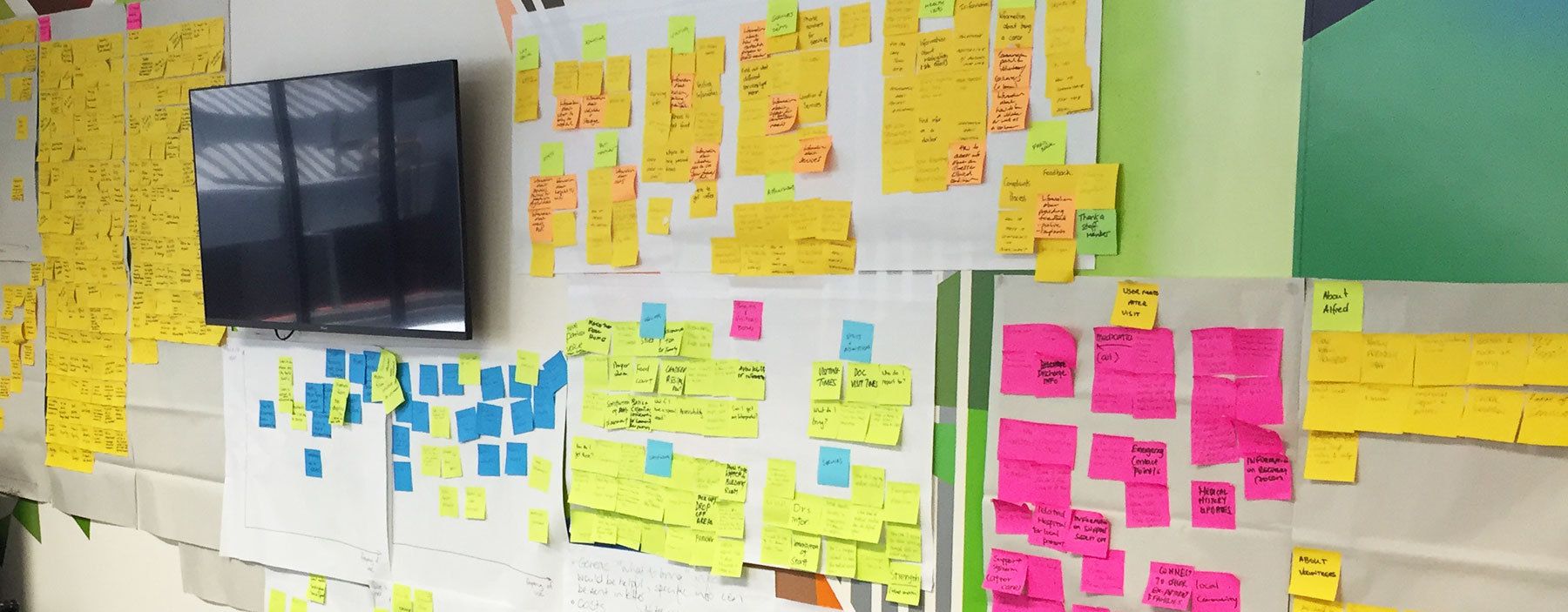
Our work started with a series of workshops and interviews with key internal stakeholders and website users, an extensive heuristic review, and benchmark moderated user tests to better understand the existing landscape and where it was failing users.
Through this research, we identified critical pain points that had strategic implications. Users were overwhelmed by legal terminology and struggled to understand which division of VCAT handled their particular dispute – this wasn't just a usability issue, it was preventing people from even beginning their journey through the tribunal process. The navigation structure reflected internal organisational logic rather than user mental models, creating a fundamental disconnect between how VCAT thought about its services and how Victorians thought about their disputes.
People representing themselves needed to quickly understand processes, deadlines, and requirements, but this information was buried or scattered across multiple pages. This wasn't just inconvenient – it was a barrier to justice for those who couldn't afford legal representation.
We also discovered something critical about designing for crisis: people under stress have reduced cognitive capacity. They can't process complex information, navigate ambiguous interfaces, or remember multi-step processes. This insight shaped our strategic approach – we needed to design for people at their worst, not their best.
The strategic brief became clear: create a platform that reduces harm through design, enabling equal access to justice regardless of digital literacy, education, language, or disability.
Having gained a deep understanding of the various user groups' needs, we set to work making sense of the wealth of data at our fingertips. Working closely with VCAT, we co-designed a new solution from the ground up that prioritised clarity, accessibility, and task completion.
We started with an extensive content audit and information architecture redesign, fundamentally restructuring how information was organised around user tasks and needs rather than internal divisions. The new structure reflected how people actually thought about their disputes – by the problem they faced, not by VCAT's organisational chart.
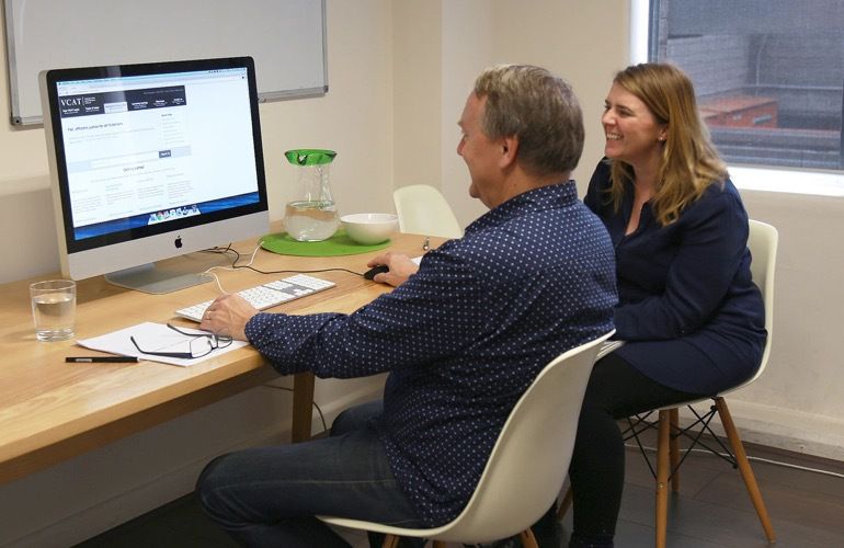
We developed a detailed wireframe prototype that was tested and iterated with real users representing the diversity of VCAT's audience. We ensured people could actually complete critical tasks: understanding which division to apply to, finding the right forms, understanding deadlines, and knowing what to expect at their hearing. Each iteration focused on reducing cognitive load and removing barriers.
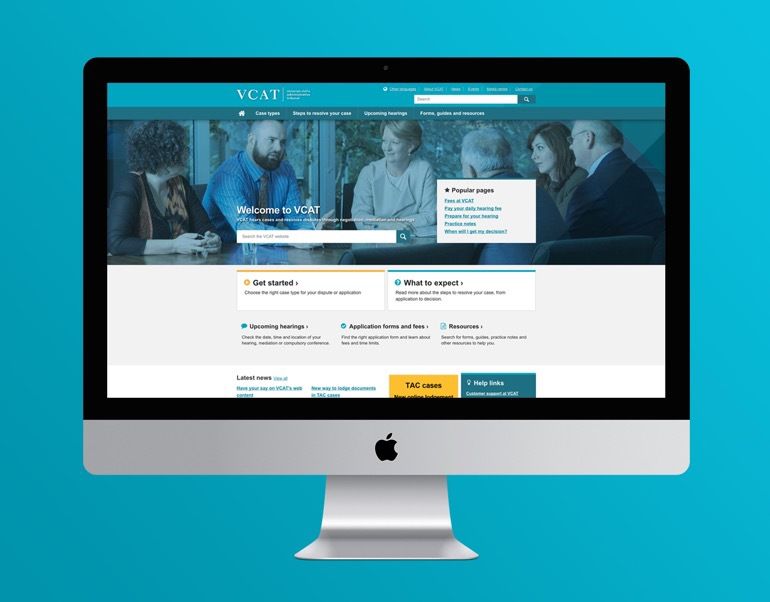
Drawing from the outputs of the preceding phases, we designed and developed the solution in line with the organisation's brand style guide using responsive web design methodology to accommodate a variety of screen sizes and resolutions. Recognising that many Victorians would access the site on mobile devices – often in stressful moments needing quick answers – mobile experience was prioritised, not just accommodated.
Given the breadth and diversity of the audience, particular attention was paid to testing and reviewing the site for accessibility, ensuring AA standards were met throughout. This wasn't checkbox compliance; it was a strategic commitment to ensuring everyone could access justice.
Outcome
The new VCAT website launched in July 2016 to great success and quickly became a key part of VCAT's service offering. Both the organisation and the community responded positively to the site, which now provides a much better experience for all users.
The impact was immediate and significant:
- Bounce rates down 40%
- Sessions up 71%
- Session times up 27%
These metrics translated to real outcomes: more Victorians were able to complete their tasks on the site, understand the tribunal process, and represent themselves effectively. The tribunal saw reduced calls to their service centre for basic questions, as people could now find answers themselves. Most importantly, the improved self-service capability supported VCAT's mission of accessible, affordable justice.
Reflection
This project taught me that designing for high-stakes, one-time-use systems requires a fundamentally different strategic approach than designing for commercial products or services.
In commercial digital products, you can afford to let users learn over time. They'll make mistakes, figure things out, and return. But when someone visits VCAT's website, they're often facing the most stressful situation of their life – a rental dispute that threatens their housing, a planning matter affecting their home, a guardianship issue involving a loved one. They visit once, they're under enormous stress, and they cannot afford to get it wrong.
This led to a strategic principle: design for people at their worst, not their best. Assume limited cognitive capacity, assume stress, assume unfamiliarity with legal processes, assume limited digital literacy. When you design for these constraints, you create something that works for everyone.
The accessibility work proved particularly important strategically. VCAT serves an incredibly diverse audience – different ages, education levels, digital literacy, languages, and abilities. Designing to AA standards wasn't just about compliance; it was about ensuring that everyone, regardless of circumstance, could access justice. In this context, accessibility isn't a feature – it's a fundamental requirement for equity.
The increase in session time was especially telling and revealed something counterintuitive about success metrics. Typically, you want to reduce time on site, but for VCAT, longer sessions with lower bounce rates indicated something positive: people were staying to find the information they needed rather than giving up in frustration. They were reading guides, understanding processes, and preparing for their hearings. Success wasn't speed; it was comprehension and confidence.
This project also reinforced that design is never politically neutral, especially in public services. When you make a tribunal website easier to use, you're making justice more accessible. When you reduce the cognitive load required to understand processes, you're supporting people who can't afford lawyers. When you ensure accessibility standards, you're enabling people with disabilities to represent themselves. These are strategic choices about who gets access to justice, not just design decisions about button placement.
The work demonstrated that strategic UX in the public sector isn't about conversion rates or engagement metrics – it's about reducing harm, enabling equity, and supporting people through difficult moments in their lives. That requires a different lens, different principles, and a deep commitment to designing for the most vulnerable users first.